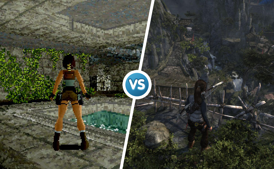
Those of us who grew up with arcade classics like Frogger and Donkey Kong couldn’t have imagined a day when video game budgets rival those of Hollywood blockbusters. Given the exponential growth of computing power in the past few decades, it’s fun to compare what video games look like now and then. Take a gander at the top 10 games that have seen significant graphical improvements over the years. Who is the number 1 in the The Evolution of Video Game Graphics Top 10?
1. Grand Theft Auto
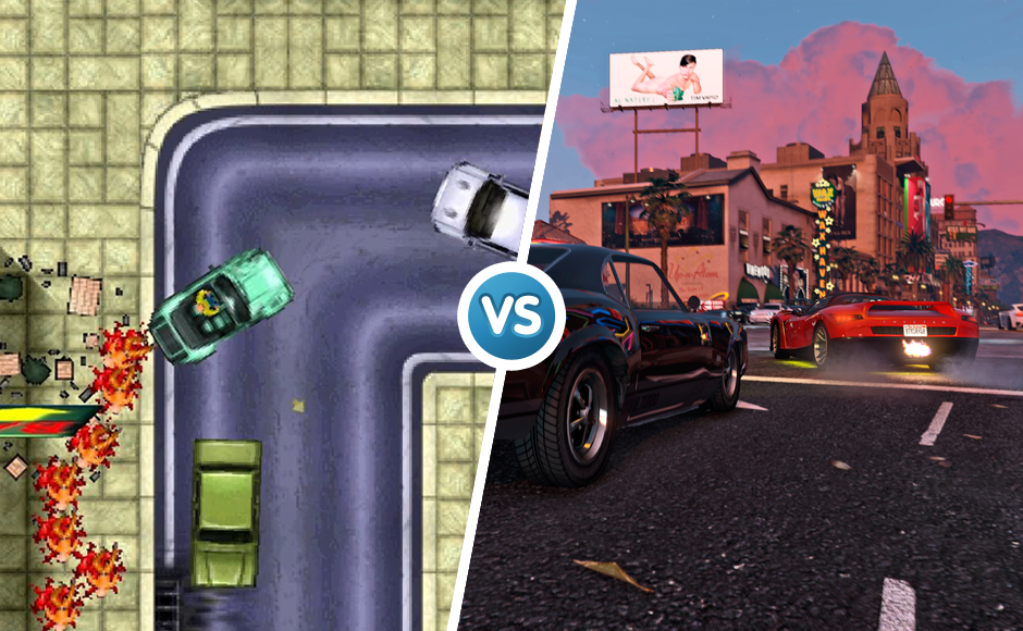
The Grand Theft Auto franchise has been giving parents nightmares since 1997 when the first installment arrived on the PlayStation console. The UK newspaper Daily Mail’s cry to ban the game because of its sensational depiction of reckless driving only helped catapult GTA into the public eye, and the series has been riding a wave of success ever since. The original GTA was both hailed and hated for its violence, but the top-down graphics look quite tame compared to the cinematic quality of later games. Grand Theft Auto III saw an evolution in graphical style, which helped spawn the spin-off titles GTA: San Andres and GTA: Vice City. Upon its release in 2013, GTA V set a new record for the most expensive game ever made with a marketing and development budget exceeding $265 million. GTA V’s setting is modeled after southern California, and the developers used real Google Maps projections of Los Angeles to design the game’s roads. They also studied census data and took road trips around the city to authentically capture the feel of SoCal.
2. Pokémon
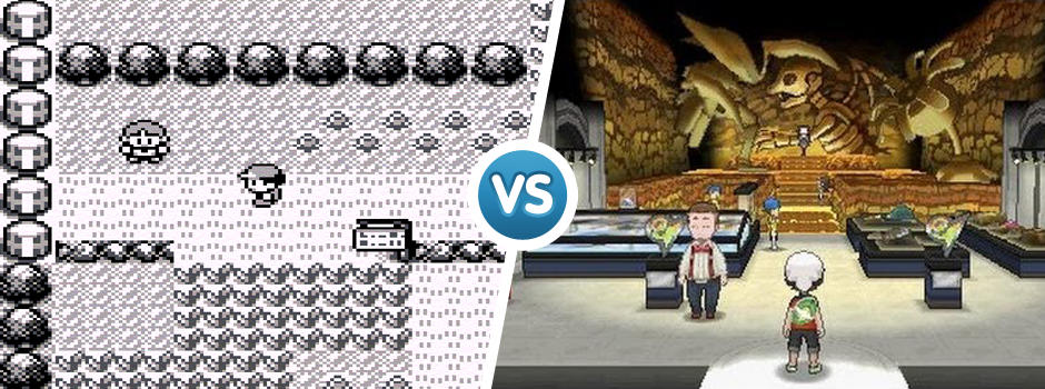
Pikachu and his pals have come a long way since their days on the original Game Boy. At a time when handheld games were in their infancy, Pokémon employed the power of monochrome pixels to portray hundreds of unique pocket monsters worth trading with your friends. Every entry in the series has been simultaneously released in different versions; for example, Pokémon Red and Blue both debuted in 1996 and are essentially the same game, but they each contain a unique roster of monsters.
Further releases have followed this formula with the exception of the Nintendo 64 spin-off Pokémon Snap, which showcases three dimensional renderings of the most popular Pokémon. Today, the tradition of raising cute critters for a lifetime of endless battles continues on the Nintendo 3DS with Pokémon Omega Ruby and Pokémon Alpha Sapphire.
3. Super Mario Bros
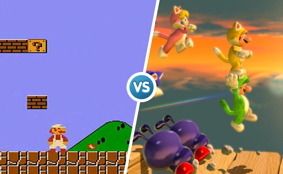
In 1985, Super Mario Bros. laid the groundwork for what video games would be like going forward. The underground caverns, lava laden castles and deep sea landscapes were a massive leap of improvement from the primitive graphics that gamers were accustomed to on the older Atari consoles. They deserve a spot in the shortlist, the evolution of video game graphics was massive. Thirty years and literally hundreds of Mario titles later, Nintendo’s formula has stood the test of time. While games like Super Mario 64 and Super Mario 3D Worlds spearheaded the three dimensional graphical eras of their time, other recent installments, such as New Super Mario Bros. U, returned to their 2D side-scrolling roots with vast stylistic improvements. In celebration of the Italian plumber’s thirtieth anniversary, Nintendo has put power in players’ hands with Super Mario Maker, a level creation tool that lets gamers make and share their own Mario levels drawing from the graphical styles of four eras of side-scrolling Mario.
4. The Legend of Zelda
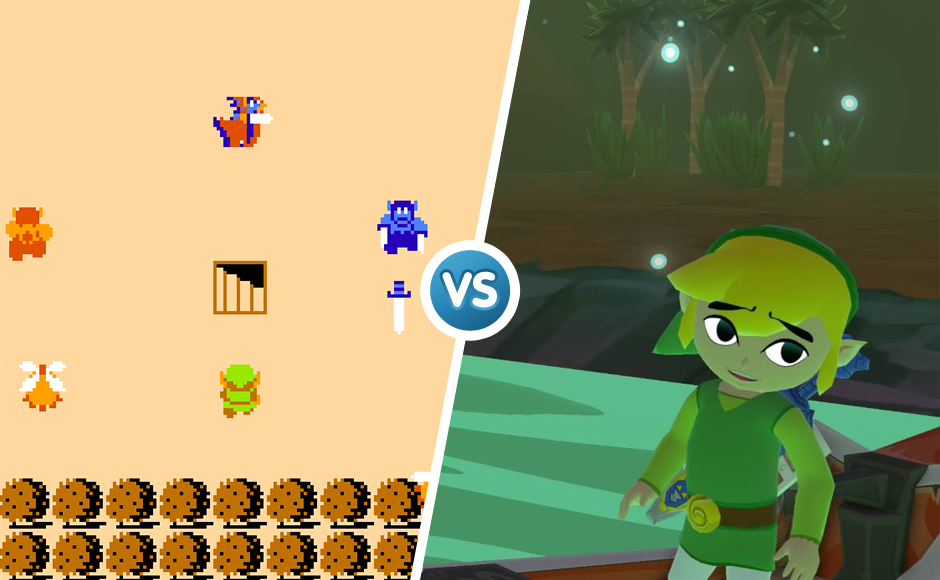
Designer Shigeru Miyamoto has said that the original Zelda was inspired by the imaginary games he played as a child exploring the woods in his Japanese hometown. The simple color palette left a lot to players’ imagination, and the story of Link saving Princess Zelda has since been retold in a myriad of graphical styles. The Ocarina of Time for the Nintendo 64 saw the transition from two dimensional to three dimensional graphics and is considered one of the most revolutionary games of its time, so much so that it received a stereoscopic re-release on the Nintendo 3DS. A Link Between Worlds pays homage to the overhead style of the original, while the HD version of The Legend of Zelda: Wind Waker for Wii U looks like a fluidly animated Disney film.
5. FIFA
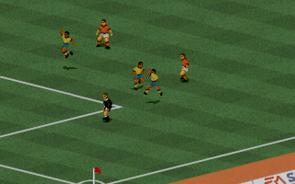
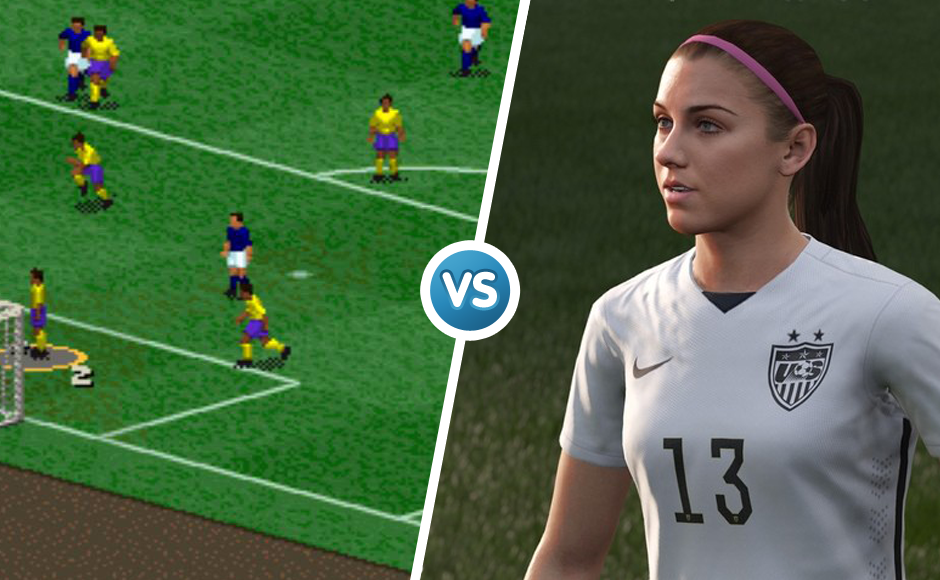
1994’s FIFA International Soccer holds a special place in history for being one of the first sports game to use an isometric camera angle to aid the illusion of three dimensional graphics. Don’t bother trying to make out who the pixelated players are supposed to represent; Electronic Arts didn’t bother incorporating real life athletes into the original roster.
FIFA 96 was the first soccer game to feature 3D graphics and real player names, though the blocky designs are barely distinguishable from one another. FIFA 16 finally looks like the real deal and is the first game in the series to feature female players; it’s about time! There’s no need to fret if your favorite team doesn’t bring home the World Cup. Now, who wins the big tournament is up to you.
6. Final Fantasy
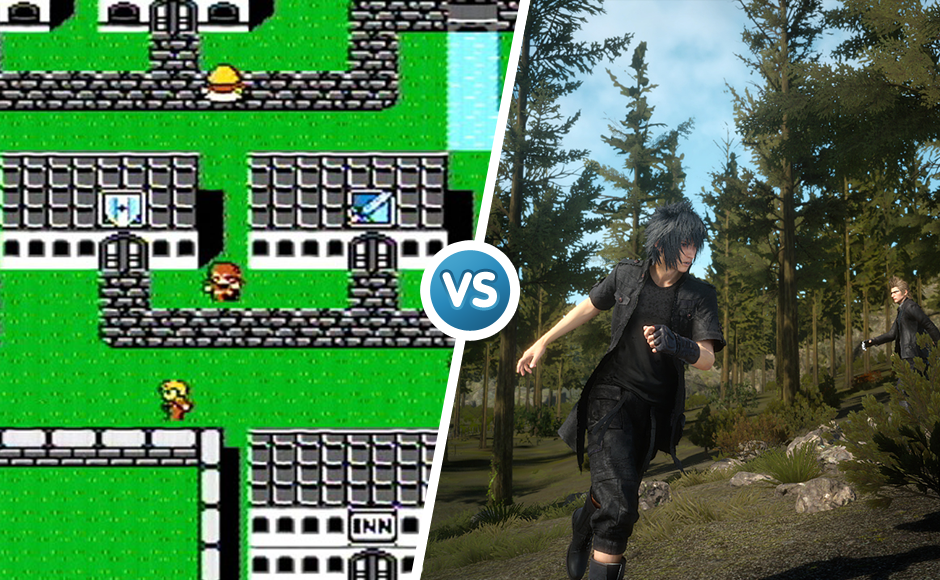
The ironically named 1987 role-playing game Final Fantasy was intended to be gaming company Square’s last hurrah. Three decades, fourteen sequels and dozens of spin-offs later, the franchise name is synonymous with lengthy adventures and groundbreaking graphics. Many critics consider 1997’s Final Fantasy VII for the PlayStation to be a game-changer for the industry much like Citizen Kane was for film in that it set the standards for the cinematic cutscenes you see in games like GTA today. Since then, each new entry in the main series has striven to raise the graphical bar for all video games. Several Final Fantasy titles have received graphical makeovers as fans await new sequels; comparing the PS3 remaster of Final Fantasy X with its PS2 source material is a testament to how much difference a decade can make. The gorgeous recently released demo for Final Fatasy XV indicates that Chocobos will likely continue carrying the torch for generations to come.
7. The Elder Scrolls
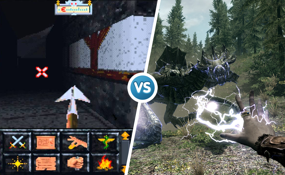
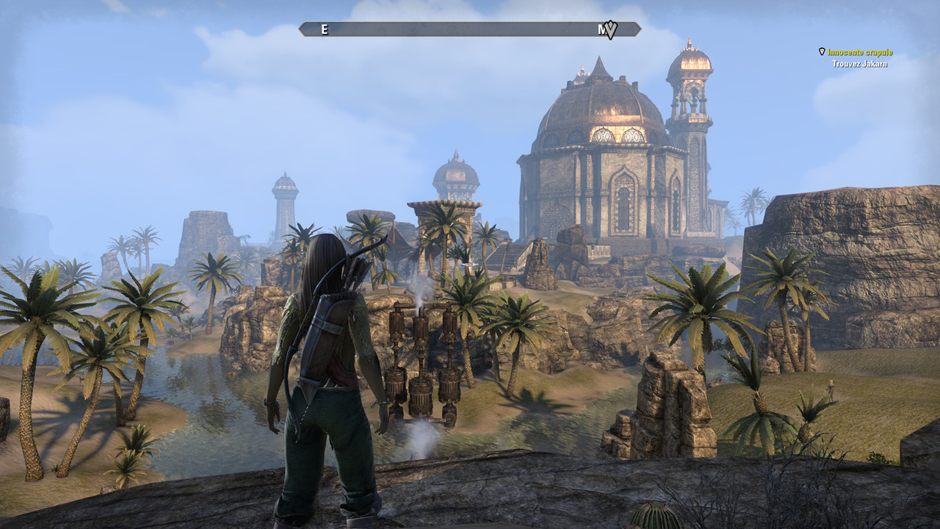
If you didn’t know any better, you might mistake screenshots from The Elder Scrolls: Arena for amateur artwork made by a middle school student in Microsoft Paint. To streamline teamwork between the thousands of artists needed to make 2002’s Elder Scrolls III: Morrowind. Bethesda created the Elder Scrolls Construction Set, which shipped with the game to give players a chance to design their own worlds using the same tools as the designers. Bethesda built a brand new engine to develop 2011’s Skyrim, which introduced minute details such as dynamic weather effects; for example, the branches of trees and bodies of water move with the wind, and all objects cast a shadow relative to the position of the sun.
2014’s Elder Scrolls: Online is the first entry to allow players to endlessly roam the continent of Tamriel.
8. Delicious
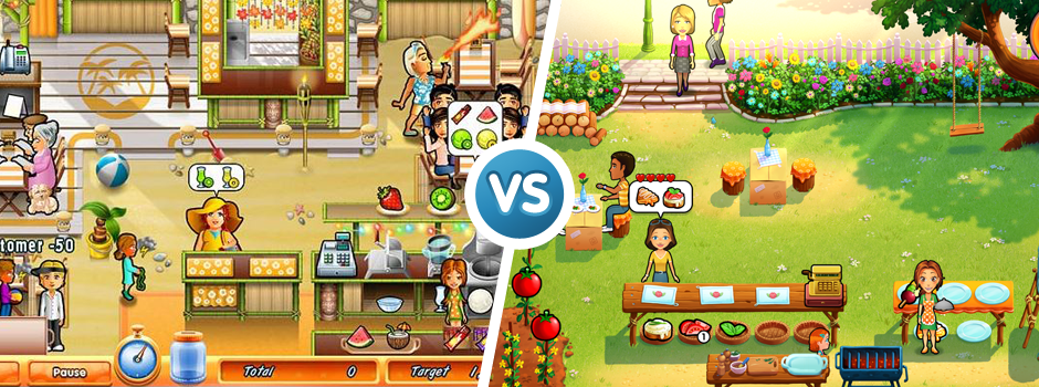
The Internet opened the door for new developers and new gamers alike. In the 21st century, players now value a quality experience over shiny 3D character models, and what counts as graphically appealing is quickly changing. The Delicious series demonstrates that you don’t need a multi-million dollar budget to look good; you just need talented artists who can create a world that matches the feel of the game’s story and play mechanics. Nonetheless, better technology and bigger budgets have helped the GameHouse staff better translate their artists’ vision to the end product over the years, which is evident when comparing Emily’s Home Sweet Home to Delicious Deluxe now and then.
9. Metal Gear Solid
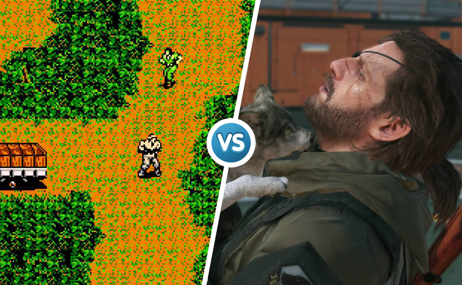
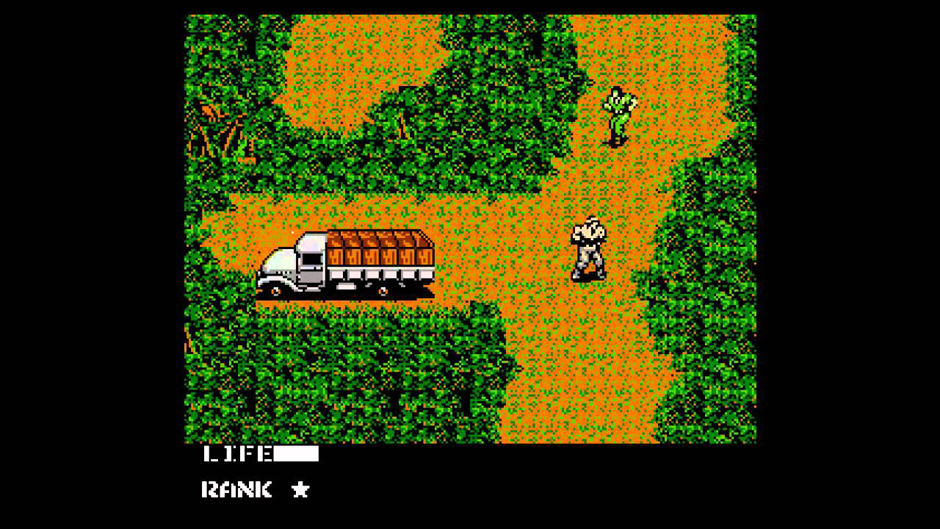
While the Metal Gear series officially began on the original Nintendo, most gamers consider Metal Gear Solid for PlayStation to be the true start of the franchise. The game tasks players with helping hero Solid Snake sneak his way around corners that showcase late 1990s pixel shading at its best. The first two entries are set in dark, urban environments while the third installment took players back in time to the Soviet jungle. Venom Snake, the protagonist of Metal Gear Solid V, looks a lot more rugged than his predecessors thanks to the power of modern processors.
To give a tribute to the founders of Metal Gear:
10. Tomb Raider
It’s hard to fathom that Laura Croft’s crude, polygonal body was once attractive to teenagers. The first Tomb Raider was one of the earlier mainstream games to use “realistic” character models; however, in retrospect, young Laura looks more like the cast members of The Lego Movie than Angelina Jolie in the 2001 Tomb Raider film. The series received its first reboot in 2006 with Tomb Raider: Legends and merited a re-reboot in 2013 simply named Tomb Raider. A follow up is due in late 2015. How can the inevitable re-re-reboot look any better in 2026?
As the gaming audience evolves and their tastes become more refined, good graphics will likely depend less on technological limitations and more on the creative limits of designers. For example, the latest Yoshi game, Yoshi’s Wooly Worlds, re-imagines Nintendo’s most popular dinosaurs as yarn plushies. With that in mind, it’s fun to imagine what series like Splatoon will look like in ten years. Will we be playing paintball in virtual reality, or will 2025 see a return to 1995 with purposely primitive polygons for nostalgia’s sake?
What are some classic games you grew up with that have gotten graphical makeovers? Do you think better graphics have made for better games? Given how realistic today’s games look, what will video games look like in 2025? How will the next Top 10 Evolution of Video Game Graphics list look like? Comment below and share this post to start the conversation!

